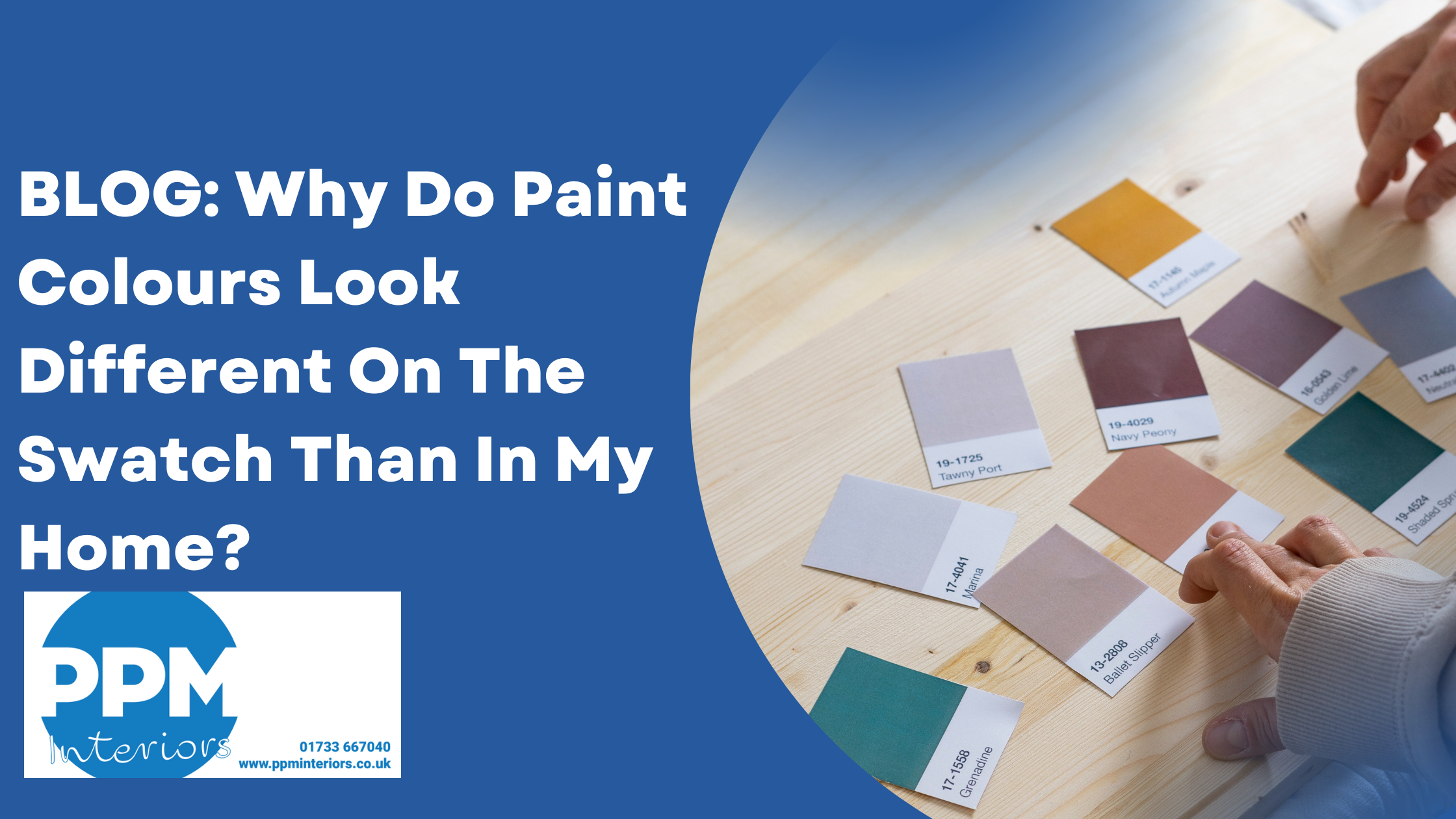
Have you chosen the dream paint colour for your kitchen? You get the swatch and love it. Then it goes up in your home and it looks completely different? We know how annoying that can be – especially when you go to all the effort of choosing the perfect colour. So, in this blog post we want to look at why paint colours look different on the swatch than in your home. We will also share how you can overcome this.
Here at PPM Interiors, we deal with a lot of kitchen paint queries. This is because we sell symphony kitchens that offer a range with over 22 different colour options. Our customers like us to recommend colours that work matching and contracting against these kitchen colours. This is why we believe we are well placed to help you understand why paint colours look different on the swatch than in your home.
Below we answer two frequently asked questions about why paint colours look different on a paint swatch to your home.
Do you recommend adjusting the paint percentage depending on how you want it to look and what is the best way to do that?
Absolutely! Adjusting the paint percentage is a legitimate and often recommended way to customize a paint colour. Here’s why and what it accomplishes:
- Subtlety and Depth: A colour at 50% will be lighter and less saturated than the 100% version. This can be desirable if you love a particular hue but find it too intense for a whole room, or if you want to create a more muted or sophisticated feel or even feature wall!
- Light Reflection: Lighter percentages will reflect more light, making a room feel brighter and more open. This is particularly useful in rooms with limited natural light or less open spaces such as doors & windows.
- Undertones: While a full-strength colour might have strong undertones that are noticeable, a lighter percentage can sometimes soften or slightly alter those undertones, making the colour more adaptable to your existing furnishings or lighting.
The best way to do this is as follows.
- Start with the 100% Colour (the “Swatch”): You choose a paint colour you like from a paint swatch or using a Ral code which can be issues directly with us for any Symphony kitchen colour.
- Dry Time: Paint often dries a shade or two darker than it appears when wet, so let your samples fully dry before making a decision.
Do you ever recommend using different percentages if you want a monochromatic look with slightly different percentages on walls vs. trim, for example?
- Choose Your Base Colour: Start with the core colour you love. This will be your “100%” or perhaps the slightly darker percentage you use for a dominant element.
- Consider the Sheen: This is another crucial element in a monochromatic scheme. Even if you use the exact same percentage of colour, changing the sheen will create definition.
Walls: Typically use a lower sheen like flat, eggshell, or matte for a softer, more absorbent look.
Trim: Often painted in a higher sheen like satin, semi-gloss, or even full gloss.
- Think About Ceilings:
Same as Walls (or lighter): For a truly immersive monochromatic look, you can paint the ceiling the same percentage as the walls or go even lighter (e.g. 50% of the wall) to maintain an airy feel.
Need help choosing the right colours for your kitchen or home? Pop into our kitchen showroom in Peterborough to see the different colours we have available. We can help you choose the right kitchen colour, wall colour and floor colour to suit you and your home.